InDesign Magazine Spread

For my first InDesign project, I created a magazine spread for the article titled “Songs Sung and Unsung” by Elder Jeffrey R. Holland. You can read the full article here.

Front Page
Second and Third Pages

Intended Audience

My intended audience was teens and young adults from the Church of Jesus Christ of Latter-day Saints, since the article is from General Conference. Since my audience was for younger adults, I wanted to incorporate some modern elements into my design.

I want the audience to feel peace and hope not only through the article, but through my design. I used cool, calm colors like blues, greens, and brick-red to add a calming, peaceful tone to my design.

Photography

Both pictures on my magazine spread are my own. On the front page, I placed a picture of a hymn book, to match the theme of the article, which is music. In addition, the hymn book is open to the song “There is Sunshine in My Soul Today” which Elder Holland references a couple times in his talk. Since there are lots of blues and greens in the background of this photo, I decided to incorporate those colors throughout the rest of my design.

Photo by Colette Prusse

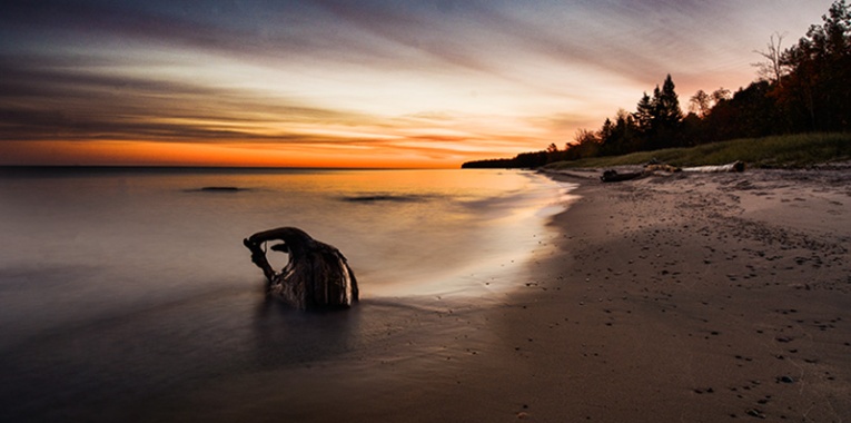
On the second page, is a picture of the Provo City Center Temple. The reason I used this photo was because I loved how the red brick on the temple matched the red brick in the background of the previous photo. I also love the deep blue sky in the background. I really think it matches with the blue in the rest of the spread. The temple is a place where members of the church can feel peace, which is why I think the picture goes well with the peace Elder Holland mentions in his talk.

Design Elements

I wanted to make sure my typography was contrasting and each portion stood out. For the title I used a sans serif font, and for the body copy I used a slab serif font. For the pull quote, I used that same sans serif font I used in the title.

I used a two-column layout in my design to help break up the text. I also added in 3 subheadings to break up the text. This helped with the design a lot because it made the text much easier to read. Had I not split up the text, it would have just looked like a big slab of text that no one would want to read.

There are two text wraps in my design. The first one is the picture of the temple, with the text rounded around the photo. I love this text wrap, and it’s probably one of my favorite parts of the design. The second text wrap is around the pull quote on the third page. I had to play with the spacing and kerning a lot on these text wraps to make sure they looked perfect.

Conclusion

I loved how my design turned out. I think the colors and photos go very well together and really complete the spread. The audience will feel peace and happiness after reading the article, and the design enhances those feelings. I had a lot of fun experimenting with InDesign. Although it was challenging at times, I am excited to experience and learn more about InDesign in later projects.


Photography Analysis

Photography is more than just taking photos of whatever you want. It takes practice, skill, and knowing the rules. Below I have analyzed a three different photos and how well they used the rule of thirds, leading lines, and depth of field. In addition, I have taken my own photos that illustrate these three principles.

Rule of Thirds

Sunrise in Lake Superior

The rule of thirds is met by dividing your image into thirds both ways, and putting points on interest along the intersecting lines, or the lines themselves. I have analyzed this photo of a beach at sunset. I was unable to find the photographer’s name, but you can look at the photo here.

As you can see, the photographer put the piece of driftwood on the bottom left intersection. My only complaint about this photo is that the horizon is a little bit below the top thirds line. The horizon should usually be placed perfectly along one of the lines.

Rexburg Temple at Sunset

This is a picture I took of the Rexburg temple at sunset. I placed the temple on the bottom right intersection, and the horizon on the lower thirds line. Because I used the rule of thirds, nothing in the picture is centered and it looks more visually appealing.

Leading Lines

Using leading lines in Photography is very important because lines naturally draw your eye to the subject of the photo. I analyzed this photo of tulip fields by Jim Zuckerman. You can see this photo and more of Zuckerman’s work here.

The natural lines between the tulip fields naturally draw the eyes to the windmill, which is the subject of the photo.

This is a photo I took at the Idaho Falls Shop, Love at First Bite. They have rows of different olive oils and balsamic vinegars in their store, so I decided to take an angled shot of the canisters, utilizing the lines the canisters formed. This photo also displays Depth of Field, which I will talk about next.

Depth of Field

Depth of Field is the range of focus in your picture and can help the viewer to know what the subject of the photo is. I analyzed this picture of colorful lightbulbs. I was unable to find the photographer’s name, but you can look at the picture here.

Notice how the green lightbulb in the front is in focus, but the rest of the lightbulbs behind it are blurred.

I took this picture of a candle in my kitchen. I focused in on the candle, so that the background of the photo would be blurred. This demonstrates depth of field.

Conclusion

Applying different techniques like the rule of thirds, leading lines, and depth of field can make photographs look more appealing to the eye and more professional. There are times however, when these rules can be broken to create an even more professional look. Just remember, you have to know the rules in order to break the rules.

Spring Into Typography


Mormon Channel has a blog that contains a “daily quote” page. I chose to analyze this daily quote design, that features a quote from Gordon B. Hinckley. People from all over can submit quote designs to be featured on Mormon Channel’s blog and other social media platforms. Mormon Channel did not attribute this design to anybody, so I was unable to find the designer.

Typeface #1

The first font used is a slab serif font. This was identified by the little ticks or lines that are on the edge of each letter. These are serifs, more specifically slab serifs because they are the same thickness as the rest of the letter. Throughout the entire font there is no thick to thin transition.

Typeface #2

The second font used is a sans serif font. I know it is sans serif because there are no ticks or lines on the edge of each letter, aka there are no serifs. There is also no thick to thin transitions in the strokes.

Contrasting Elements

The two fonts have a lot of contrasting elements. The first element being that they are in different categories (one is slab serif and one is san serif). The next contrasting element is that the slab serif font is a lighter stroke with a bigger point size, and the sans serif font is more bold with a smaller point size. I like how the designer did the thickness and point size because it makes each line of text stand out. I also like how the two typefaces are alternated (they are repeated on every other line). In addition, the designer made the name at the bottom lighter and smaller so that the eye focuses on the quote and not on the person who said it. My eyes can easily read the text from top to bottom.

Conclusion

The designer did a great job with the text, especially since this design is all about the quote. One thing that made this design stand out to me in general was how simple it was. I love how they added a cute vase of tulips and a white background, and the color of the text is the same color as the flowers. The text is in perfect alignment with the flowers and everything flows so nicely. This design has a nice spring-y feel and the text really contributes to the theme. I would definitely print out this design and hang it on my wall!